


『味ぽん®』をアートに。タコマフジレコードと3人のアーティスト。
TACOMA FUJI RECORDS and the three artists that made “AJIPON®" as art.
誰もが一度は口にしたことがある 「ミツカン」の『味ぽん』。〈ビームスT(BEAMS T)〉は、この国民的調味料とともに、当たり前すぎて見失いがちな“半径1mのしあわせ”にアートの力で光を当てる“味ぽんART PROJECT”を始動しました。今回登場するのは、アーティスティックなTシャツ。〈タコマフジレコード(TACOMA FUJI RECORDS)〉が考案した架空のストーリー『THE ART OF CSSS (Citrus Seasoned Soy Sauce) / 橙藝術』をもとに、名古屋で活動する3人のアーティストにデザインしてもらいました。名古屋に足繁く通う〈タコマフジレコード〉主宰の渡辺さんと一緒に参加アーティストのもとを訪ね、三者三様のデザインができるまでのストーリーをお届けします。
Everyone has had a taste of Mizkan’s "AJIPON" at least once. BEAMS T has launched the "AJIPON ART PROJECT" to shed light through the power of art on this nationally popular seasoning, as well as the "happiness within a meter radius" that we tend to lose sight of because it is so commonplace. This time, artistic T-shirts will be available. Based on the fictional story "THE ART OF CSSS (Citrus Seasoned Soy Sauce)" created by TACOMA FUJI RECORDS, three artists active in Nagoya were asked to design the T-shirts. We visited the participating artists together with Mr. Watanabe, the organizer of TACOMA FUJI RECORDS, who frequents Nagoya, and present the story of how the three artists' designs were created.
PROFILE

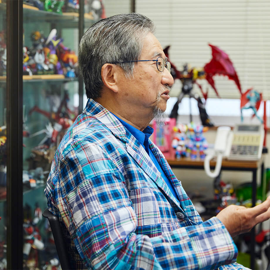
渡辺友郎
(タコマフジレコード代表)
アメリカの大学を卒業後、サラリーマンを経て、レコード会社に転職。ビジュアル・プランナーとしてCDジャケットや物販アイテムの制作を担当し、2007年に独立してクリエイティブ・プロダクション「Lodge ALASKA」を設立。2008年に、架空のレコードレーベルをコンセプトに国内外のクリエイターがデザインを手掛けるTシャツブランド〈タコマフジレコード〉を始動する。犬とビールが大好物。
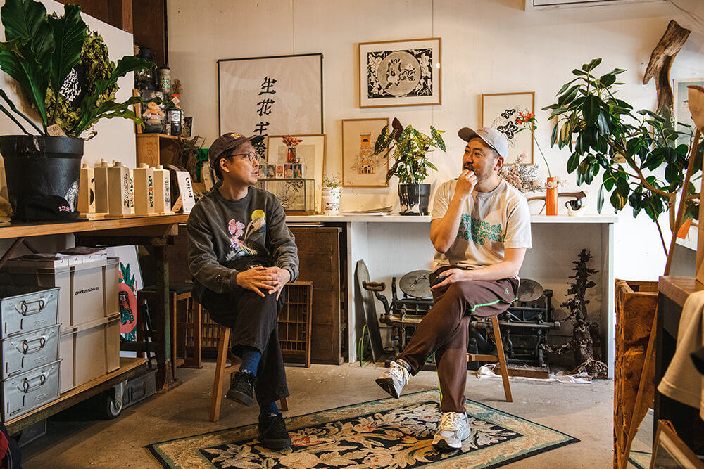
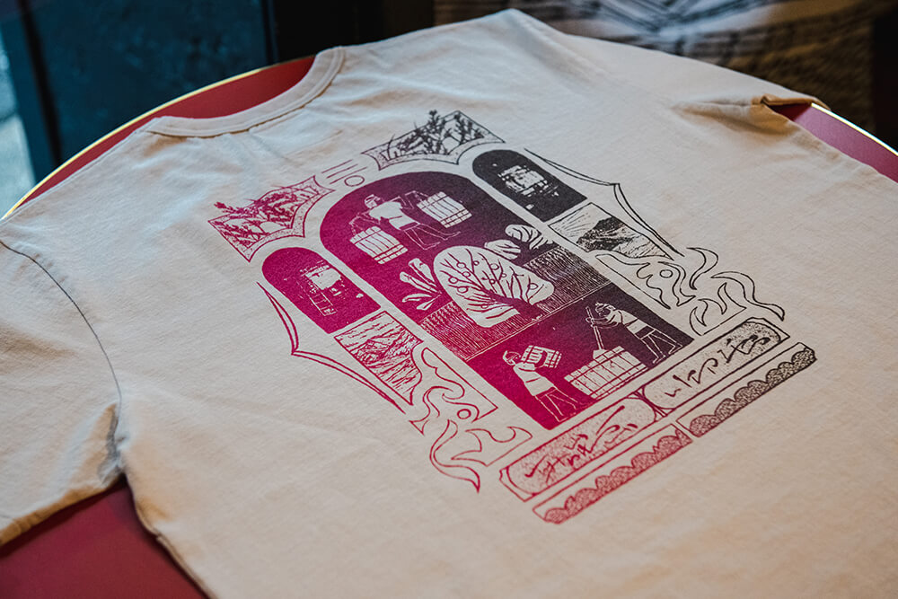
製造工程や環境を描いて豊穣を表現。

2015年に「タンブルウィード」を立ち上げた井本幸太郎さん。アートとカルチャーの視点から植物に触れる機会を提案している。渡辺さんもメンバーであるスタイリストの岡部文彦さんが主宰する「VALLICANS」に所属。
ー 「タンブルウィード」では、〈タコマフジレコード〉のTシャツも販売しているんですね。
井本:花屋ですが、〈タコマフジレコード〉のTシャツを取り扱いたくて、声をかけさせてもらいました。だから、ナベさん(渡辺さん)との付き合いは10年くらい。でも当初は、お店へ来たことはなかったですよね。
渡辺:5年くらい前、ジェリー鵜飼さんが「タンブルウィード」で個展を開催した時が初めてかな? いや、違う。その前に1回来てるか。
井本:でも、その時はとんぼ返りで、仕事をしに来たって感じでしたよね。
渡辺:そうだったかも。「タンブルウィード」は、花屋でありながら、アパレルやZINEを取り扱ったり、井本さんがデザイン業もしている。そういう感度の高い場所って多くないですよね。興味深い活動をしているなって印象です。


井本:ぼく自身デザインをするので、それと花や植物をうまく調和させたお店を目指しました。
渡辺:お店はもちろんだけど、井本さんは作家としても、友達としても不思議な魅力があって面白いんです。たとえば一緒に夜中まで飲んでいて、そろそろ帰ろうかって話していたのに、「やっぱもう一軒行く?」とか冗談で言うと、井本さんは無言で露骨にがっかりした顔するんですよ。舌打ちしたり (笑)。普通ならぼくの方が先輩だし気を遣って、ちょっとは話に乗っかるじゃないですか。憎めない愛嬌のある人です。
ー お二人はこれまでに協業したことはありますか?
渡辺:3年前にここで、〈タコマフジレコード〉のポップアップイベントをやらせてもらって。あと去年、初めて井本さんに〈タコマフジレコード〉にアートワークを提供してもらいました。
井本:付き合いが長いから、〈タコマフジレコード〉のTシャツのつくり方やお願いするアーティストの選び方を聞いていました。周りの人がいいと言っているアーティストでも、ナベさん自身の感性が反応しないと絶対に依頼しないんですよ。だから、デザインさせてもらえて光栄でした。
渡辺:井本さんがきゃりーぱみゅぱみゅの『ガムガムガール』のMVに提供したオリジナルの漢字がとても印象的で、「別の書体であの架空の漢字書けますか? Tシャツをつくりませんか?」ってお願いしました。ずっと付き合いはあったけれど、ぼくと井本さんがお酒飲んだりふざけたりする以外で、初めて通じ合った瞬間でしたね。
ー 井本さんが「イフニ ロースティング アンド コー」へデザインしたTシャツを〈ビームスT〉のディレクター水村が気に入ったこともあり、今回オファーさせてもらいました。渡辺さんが考えたストーリーをもとにデザインしてみて、いかがでしたか?
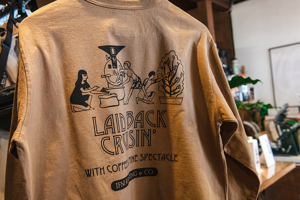
オファーのきっかけとなった、静岡のコーヒーショップ「イフニ ロースティング アンド コー」のTシャツ。
井本:基本的に植物をテーマにデザインをしていますが、ぼくはイラストレーターではないので、表現はその都度変えるようにしています。もともと広告デザイナーをやっていて、クライアントの要望に合わせてデザインするのが本業でしたので。ナベさんが設定した架空のストーリーがなければ、『味ぽん』のノベルティのような、キャッチーなデザインになっていたかもしれません。
渡辺:誤解がないように言っておくと(笑)。『味ぽん』ってほとんどの家庭にあるものじゃないですか。もちろんぼくも大好きですよ。ただ、『味ぽん』!って直球でデザインされたTシャツをつくることが今回の目的じゃないと思いました。大事なのは『味ぽん』の魅力を伝える事で、求められたのはノベルティをつくることじゃないなと。どうしたら全員がやってよかったと思えるプロジェクトにできるか。ぼくに求められたのはそのルール整備みたいなところです。そして、“『味ぽん』への直接的な表現はしない”をルールにして、架空のストーリーを元に、各アーティストに制約なしでデザインの依頼をしました。結果、同じモチーフだけど、それぞれの個性が色濃く映し出されたTシャツができたと思います。
ー 改めてストーリーの説明をお願いします。
渡辺:架空の人物、日本通のアイザックという人がいて、彼はミュージシャン名義としてCSSS(CARIBOU SHOWS SACRED SEA)という名前で活動しているんです。そんな彼が気の向いた仲間と組んだバンド「THE ART OF CSSS(Citrus Seasoned Soy Sauce=味ぽん)」が、横浜と下北沢でライブを開催した時に販売したTシャツを復刻したもの、というストーリーになっています。
ー 渡辺さんの架空のストーリーによって、デザインの幅がぐっと広がりましたよね。井本さんのデザインの着想源はなんですか?
井本:「ミツカン」の本社には、酢づくりの歴史を学べる「MIZKAN MUSEUM(ミツカンミュージアム)」が併設されているんです。そのルーツと現代を繋げたデザインにしました。古代の壁画がモチーフになっていますが、特定のものを匂わせたくなかったので、どこの国とも言えない要素をミックスしています。
以前、〈タコマフジレコード〉とTシャツをつくった時、架空の漢字をデザインさせてもらって、ナベさんはそれがいいと言ってくれたんです。だから、今回のデザインも捉えどころがないけど、全体的にぽん酢をつくる工程や環境を描いて、豊穣を表現しています。色もめちゃくちゃいいですね。
渡辺:色はぼくが決めさせてもらいました。オリジナルのアートワークはモノクロで、ストレートに白ボディに黒でプリントすると映えると思ったんですけど。ただ、それだと今回のテーマに対しては少しストイック過ぎる。結構悩んだ結果、グラデーションプリントだと華やかさとアートワークの持つ重厚感のバランスの具合がよくなったので、このカラーリングにしました。井本さん、これでよかったよね?
タイ語のフォントが70年代の空気を醸し出す。

2017年から6年半タイ・バンコクに住み、帰国後にタイカレー食堂「ヤンガオ」をオープンしたMOOLAさん。北部や南部など各地のタイカレーを再現して提供し、タイのカルチャーを反映したオリジナルのウエアやグッズも製作している。
ー お二人が知り合ったのはいつですか?
渡辺:去年「タンブルウィード」でポップアップイベントを開催した時に来てくれたのが最初だよね?
MOOLA:そうですね。でも、〈タコマフジレコード〉のことはタイにいた時から知っていましたよ。
渡辺:それは嬉しい。ぼくも「ヤンガオ」は雑誌で見て知っていたよ。よく名古屋に来ていたのに、お店に行くタイミングがなくて。去年の夏に初めて来たんですよ。
ー MOOLAさんがデザイン業もやっていることは知っていたんですか?
渡辺:知っていました。タイ語のグラフィックが素敵で、去年〈タコマフジレコード〉のロゴをタイ語で描いてもらいました。デザインの仕上がりが良くてみんなに着てもらいたいから、Tシャツの季節にリリースしようと先延ばしにしていて。ようやく今年発売しました。


ー そもそもMOOLAさんは、なぜタイに住んでいたんですか?
MOOLA:デザイン事務所で働いていて、バンコク支所への海外転勤があったんです。その時、今でも仲良くしているタイ人の親戚のおばさんに、タイの各地方に存在するカレー料理を教えてもらっていました。
ー それが「ヤンガオ」をオープンするきっかけになったと。
MOOLA:あと、ありがたいことに自分の好きな音楽やアート、ファッションなどを共有出来るタイ人コミュニティに早い段階で混ぜてもらえて。一緒にDJパーティをやったりする中で、自分の経験を活かせるやるべきことが明確になったんです。なので、本帰国してすぐに「ヤンガオ」をオープンしました。


ー お店のオリジナルグッズも種類豊富でいいですね。
MOOLA:例えばライブに行ったら、ぼくは物販で買い物したいんです。だから、自分でお店をやるなら、そこでしか買えないグッズをつくりたいと思っていました。「ヤンガオ」のアパレルラインとかじゃなくて、お土産の感覚です。
渡辺:それがすごく楽しそうでいい。ちょっと羨ましい。
MOOLA:日々の仕事を楽しむためにつくっているんです。次はこういうものが欲しいって、夫婦で話し合っています。
ー 今回は架空のストーリーをもとにデザインしてもらいましたが、いかがでしたか?
MOOLA:タイには、すき焼きから派生したタイスキというしゃぶしゃぶみたいな鍋料理があって、それに『味ぽん』を使うんです。ぼくのデザインはタイのカルチャーやバックボーンを反映しているので、タイでも売っていて、現地の人からも人気な『味ぽん』は、すんなりと受け入れることができました。
渡辺:MOOLAくんは、ぼくが提示したストーリーに加筆して、アナザーストーリーも考えてくれてありがたかったです。
ー ストーリーに深みが増しましたね。

MOOLA:このデザインは、70年代にタイで活躍していた「The Impossibles」というバンドのアートワークに使われているフォントから着想を得たんですよ。だから、当時の空気感を表現するために、70年代に「CSSS」がタイの「パフラットマーケット」でライブをしていて、関係者だけに配られた貴重なTシャツを復刻したっていう、アナザーストーリーを加えさせてもらいました。

渡辺:プリントの色やサイズは、MOOLAくんからのリクエストです。プロダクトの最終形に対してのイメージが明確なんだなと思いましたよ。
MOOLA:やるからには完成までやらせてもらいたくて。シルクスクリーンの版を贅沢に使わせてもらいました。上から『味ぽん』「CSSS」「パフラットマーケット」をデザインしています。
渡辺:最初に依頼した時、「デザインに『味ぽん』を組み込まなくてもいい」と伝えていたんです。ただ、MOOLAくんが能動的にその言葉をデザインに落とし込んでいました。意図して配してあるならぜひ、ということでタイ語で『味ぽん』と描いてあります。

ー 「パフラットマーケット」とは?
渡辺:実在する、おもしろいマーケットなんだよね?
MOOLA:そうなんです。バンコクにあって、週末によく行っていました。チャイナタウンとインド人街がミックスされていて、時代が止まっているかのような場所です。生地の問屋街があって、観光で行くところじゃないけど、魅力があるんです。
渡辺:MOOLAくんに提供してもらった〈タコマフジレコード〉のTシャツのタイトルにも「パフラットマーケット」が含まれていて、MOOLAくんにとって特別な場所なんだろうなと思ったよ。
MOOLA:そうですね。「パフラットマーケット」が好きという人は少ないけど、なぜかぼくは居心地よくて、しょっちゅう行っていました。実際はライブをするような場所じゃないんですよね(笑)。
親しい人が集まった団欒をイメージ。

2012年にハンバーガー&アートショップ「カクオウザン ラーダー」をオープンした丹羽洋己さん。ショップのオリジナルアイテムをデザインすると共に、日本全国や台湾などでポップアップイベントを開催中。
ー 去年と一昨年、丹羽さんには「トーキョー カルチャート by ビームス」でポップアップイベントを開催していただきました。今回は渡辺さんからのご提案でしたが、お二人はどんな繋がりなんですか?
渡辺:〈タコマフジレコード〉が毎回出店している「森、道、市場」で、丹羽くんもハンバーガーと物販で出店していたんです。そこで販売していたTシャツが、〈タコマフジレコード〉でもお願いしているアーティストの数見亮平さんがデザインしたもので。開店前に図々しく声をかけて、「すみません、売ってるTシャツのLサイズを全種類ください」って買わせてもらったのがきっかけです。
丹羽:数見さんが「ラーダー」で展示を開催してくれた時につくったTシャツです。渡辺さんのことは知っていたから、落ち着いた顔しながら、「本物だ!」って興奮していましたよ(笑)。

ー 丹羽さんは〈タコマフジレコード〉と、過去にコラボもされていますよね。
渡辺:「ラーダー」で漢字モチーフのTシャツが何種類か売っていて、それがどれもグッとくるものだったんです。思い切って「迷惑じゃなかったらデザイナーを紹介してもらえませんか?」って相談したら、丹羽くんが「それデザインしてるのぼくです」って言うんですよ。「え? 君、ハンバーガー屋じゃないの!?」ってなって(笑)。それから丹羽くんにデザインをお願いするようになりました。
丹羽:その漢字のTシャツは、「タイワンシャオツーハウスハオツーハオツーハオツー」という、「ラーダー」で台湾料理を出すイベントを開催した時につくっていたもので。お客さんからの反響が大きかったので販売もしていたんです。
ー 台湾料理だけじゃなくて、串カツを出すイベントも開催しているそうですね。
丹羽:〈タコマフジレコード〉と同じく架空のお店をつくって、実際にイベントを開催しています。串カツは「らだ八」という名前の居酒屋です。

渡辺:あとね、「ヤンガオ」もなんだけど、「ラーダー」もマジで全部美味しいんですよ。いつもお任せでハンバーガーを注文しているんですけど、トッピングしてもらったブルーチーズがすごくおいしくて、それ以来ブルーチーズは絶対に入れてもらっています。本当にオススメです。
丹羽:バンズは特別なものを使っていて、1食としての食べ応えを重視しています。食べて、海外旅行の気分に浸れるようなメニューです。
渡辺:販売しているマーチャンダイズ、オリジナルアイテムも凄くいい。

丹羽:オリジナルアイテムは、アーティストにデザインを依頼するものがあったり、ぼくがデザインしたり。もともとCDショップで働いていたこともあって、飲食店を始めてからもアイテムも販売したいと思っていました。「ラーダー」は今年で10年目になりますが、早い段階からオリジナルグッズを展開していました。
ー 今回は、渡辺さんが丹羽さんとMOOLAさんをご提案してくださいましたね。
渡辺:井本さんは、最初から〈ビームスT〉が候補として名前を挙げていましたよね。井本さんにお願いするって決める前、このプロジェクトの第一弾は1人のアーティストと一緒に取り組もうと思っていました。そこから話の流れで、デザインの型数を数種類にしようとなって。全然できるけど、その段階でTシャツ1枚1枚のデザインの濃度が薄まっちゃうのは避けないといけないなと思っていたんです。そんな時に丹羽くんから連絡があって、MOOLAくん、井本さんと一緒にいると。ぼくは3人とも友人だし、アーティストとしても認識しているので、「あ、この3人だ!」ってなって。その後、 個別に「このプロジェクトに協力してもらえないか?」って相談しました。3人は仲がいいしリスペクトのある間柄で、今回のような座組みでも適度な緊張感を楽しみながら取り組んでもらえると思って、井本さんと共に丹羽くんとMOOLAくんに協力してもらったんです。
ー 今回のストーリーをもとに、どんなデザインに仕上げましたか?

丹羽:ナベさんが考えたストーリーの中に、70~80年代の“洋楽ニューウェイヴロック的”というキーワードがあって。80年代に人気だった「Liquid Liquid」というバンドがいるから、“Liquid”という単語を使いたかったんです。そんな話をキャッチボールした結果、“LIQUID MANNER"という言葉が生まれました。たれ(LIQUID)に付けて食べる作法(MANNER)から生まれた造語です。そこにアジア感をプラスしつつ、お正月を連想するフォントで親しい人が集まるシーンをイメージしています。

ー フロントの漢字のデザインも素敵です。
丹羽:『味ぽん』の原材料に柑橘が使われているから「橙藝術(だいだいげいじゅつ)」と記載して、色も『味ぽん』のカラーにしています。元々は、架空のストーリーに登場する「THE ART OF CSSS」の漢字表記「醬藝術(ひしおげいじゅつ)」にする予定だったんですけど、それだとさすがに直球すぎるなと思って。渡辺さんと話し合う中で、いまのデザインにたどり着きました。
渡辺:Tシャツのデザインとしては、『味ぽん』感ゼロ。シンプルに強度の高いデザインのTシャツです。ただ、「何のTシャツなのか」を紐解くと実は…そんなデザインに出来たのは、今回のプロジェクトに関わってくれた方々がベストのパフォーマンスを発揮してくれたからだと思います。かなり大変だったけど楽しかったし、「ミツカン」と〈ビームスT〉の懐の深さに恐れ入りました(笑)。
3人のデザイナーが生んだこのTシャツは『味ぽん』がモチーフになっているとは気付きません。渡辺さんの言葉にもあった通り、それが今回のプロジェクトの肝だったのです。『THE ART OF CSSS (Citrus Seasoned Soy Sauce) / 橙藝術』という架空のストーリーがあったからこそ、それぞれが思うがままの解釈をし、日常に溶け込む三者三様のデザインが完成しました。ファッションの力でしあわせを提供する〈ビームスT〉とファッション&カルチャーと“普通の生活”の隙間をボーダーレスに活動する〈タコマフジレコード〉。そして、半世紀以上もの間、食卓のしあわせを見守ってきた『味ぽん』。“味ぽんART PROJECT”は、そんなそれぞれの形の“毎日のしあわせ”を、Tシャツの中に詰め込んでいます。
INFORMATION
BEAMS T TRAVELING
会期:2022年5月27日(金)〜2022年6月12日(日)
場所:ビームス 名古屋
発売日:2022年5月30日(月)
展開店舗:ビームスT 原宿、ビームス公式オンラインショップ
販売ページ
PROFILE
Tomoro Watanabe
(President of TACOMA FUJI RECORDS)
After graduating from an American university, he worked as an office worker before moving to a record company and took charge of producing CD jackets and merchandising items as a visual planner. In 2007, he established his own creative production company, Lodge ALASKA. In 2008, he launched the T-shirt brand TACOMA FUJI RECORDS, which is based on the concept of an imaginary record label and designed by creators in Japan and abroad. He loves dogs and beer.
The production process and environment are depicted to express fruitfulness.
Kotaro Imoto launched TUMBLEWEED in 2015. He proposes opportunities to experience plants from an artistic and cultural perspective. Mr. Watanabe also belongs to “VALLICANS,” which is led by stylist Fumihiko Okabe.
ー TUMBLEWEED also sells T-shirts from TACOMA FUJI RECORDS, right?
Imoto: TUMBLEWEED is basically a flower shop, but I wanted to carry T-shirts of TACOMA FUJI RECORDS, so I approached them. So I have known Nabe-san (Mr. Watanabe) for about 10 years. But in the beginning, you never came to the shop, did you?
Watanabe: Was it my first time to come here when Jerry Ukai held a solo exhibition at TUMBLEWEED about five years ago? No, it was not. I came once before that.
Imoto: But at that time, it seemed like you just made a quick business trip.
Watanabe: Maybe that was the case. TUMBLEWEED is a flower shop, but it also sells apparel and zines, and you also work as a designer. There are not many places with such good taste. I have the impression that you are engaged in interesting activities.
Imoto: I myself do design, so I aimed to create a store that blends well with flowers and plants.
Watanabe: Of course the store is charming, but Imoto-san also has a mysterious attractiveness and is interesting both as an artist and as a friend. For example, when we were drinking together until midnight and were talking about going home, I would jokingly say, “Well, let’s go to one more bar, shall we?” And he would silently and blatantly make a disappointed face. He would even click his tongue (laughs). I’m older than him, so a normal person would be a little more considerate and try to pretend to be more interested. I somehow find him charming and likable, though.
ー Had the two of you collaborated before this time?
Watanabe: Three years ago, we had a pop-up event for TACOMA FUJI RECORDS here. Also, last year, we had Imoto-san provide artwork for us for the first time.
Imoto: Since we have known each other for a long time, I had heard about how TACOMA FUJI RECORDS makes its T-shirts and how it chooses the artists. Even if an artist is good enough for the people around him, if Nabe-san’s own sensibility does not respond to it, he would never commission him/her. So I was honored to be allowed to design it.
Watanabe: The original kanji that Imoto-san provided for the music video for Kyary Pamyu Pamyu’s “Gum Gum Girl” was so impressive that I asked him, “Can you write those fictional kanji in a different font? Do you want to make a T-shirt with it?” We had known each other for a long time, but this was the first time that we communicated with each other outside of drinking and joking around.
ー Mizumura, the director of BEAMS T, liked the T-shirt that you designed for IFNi ROASTING & CO., that led us to offer you this time. How was it to design a T-shirt based on the story Mr. Watanabe came up with?
The T-shirt from IFNi ROASTING & CO., a coffee shop in Shizuoka that inspired the offer.
Imoto: Basically, I design with plants as my theme, but since I am not an illustrator, I try to change my expression each time. I was originally an advertising designer, and my main job was to design according to the client’s requests. If it were not for the fictional story set up by Nabe-san, the design might have been catchy, like the “AJIPON” novelty.
Watanabe: Let me say this so that there are no misunderstandings (laughs). “AJIPON” is something most households have. Of course I love it. However, I thought that the purpose of this project was not to create a T-shirt with a straightforward “AJIPON” design. What was important was to convey the appeal of “AJIPON”, not to create a novelty item. How can we make this a project that everyone will be happy to have done? What I was asked to do was to establish the rules. I asked each artist to design a T-shirt based on a fictional story with no restrictions, with the rule of “no direct reference to “AJIPON”. The result was a T-shirt with the same motif, but each artist’s individuality was strongly reflected in the design.
ー Please explain the story again.
Watanabe: There is a fictional character, a Japanophile named Isaac, who goes by the name CSSS (CARIBOU SHOWS SACRED SEA) as a musician. The story is that “THE ART OF CSSS (Citrus Seasoned Soy Sauce = AJIPON),” a band he formed with a group of like-minded friends, sold T-shirts when they held live shows in Yokohama and Shimokitazawa, and these T-shirts were reprinted.
ー Your fictional story has greatly expanded the scope of design. Imoto-san, what was the inspiration for your design?
Imoto: The MIZKAN MUSEUM is located in the headquarters of MIZKAN where you can learn about the history of vinegar production. I designed to connect the roots of vinegar making with the present day. The motif is based on ancient murals, but I didn’t want it to hint at anything specific, so I mixed in elements that can’t be identified with any one country.
When I made a T-shirt with TACOMA FUJI RECORDS before, I was allowed to design an imaginary Kanji character, and Nabe-san said that was really good. So this design is also elusive, but overall it depicts the process of making ponzu vinegar and the environment, expressing fruitfulness.
ー The colors are also very nice.
Watanabe: I decided on the colors. The original artwork was in black and white, and I thought it would look better if printed in black on a white body. However, that would be a little too stoic for the theme of this project. After much deliberation, I decided on this color scheme because the gradation print would strike the right balance between the glamour and the gravity of the artwork. Imoto-san, this was the right choice, wasn’t it?
The Thai font creates an air of the 70’s.
MOOLA lived in Bangkok, Thailand for six and a half years starting in 2017 and opened the Thai curry diner YANGGAO after returning to Japan. The restaurant offers reproductions of Thai curry from various regions in the north and south of the country, and also produces original wear and goods that reflect Thai culture.
ー When did you two meet?
Watanabe: The first time was when you came to my pop-up event at TUMBLEWEED last year, right?
MOOLA: That’s right. But I knew about TACOMA FUJI RECORDS from when I was in Thailand.
Watanabe: I am glad to hear that. I also knew about YANGGAO from magazines. I used to come to Nagoya often, but I never had a chance to visit here. I came here for the first time last summer.
ー Did you know that MOOLA is also in the design business?
Watanabe: Yes, I did. I really like his Thai graphics, so last year I had him draw the logo for TACOMA FUJI RECORDS in Thai. The finished design was so good that I wanted everyone to wear it. So, I was putting off releasing it until it became the T-shirt season, but I finally released it this year.
ー Why did you live in Thailand in the first place, MOOLA?
MOOLA: I was working at a design firm and was transferred overseas to the Bangkok office. At that time, I had a Thai friend, who is still a good friend of mine, and his relative taught me about the curry dishes that exist in each region of Thailand.
ー So that’s what inspired you to open YANGGAO?
MOOLA: I was also fortunate to be included early on in the Thai community, where I could share the music, art, fashion, etc. that I liked. Through DJ parties with them, I was able to clarify what I should do to make the most of my experience. So I opened YANGGAO as soon as I returned to Japan.
ー We like the variety of original goods you have at your diner
MOOLA: For example, when I go to a live concert, I like to shop for goods. So, if I were to open my own store, I wanted to create goods that could only be purchased there. It’s not that I want to make an apparel line for YANGGAO, but rather souvenirs.
Watanabe: That looks to me like a lot of fun. I envy you a little.
MOOLA: We make things to enjoy our daily work. My wife and I talk about what we want to make next.
ー How did you feel about having a design based on a fictional story this time?
MOOLA: In Thailand, there is a one-pot dish called “Thai Suki,” which is derived from sukiyaki and is similar to shabu-shabu, and “AJIPOIN” is used for it. My designs reflect the culture of Thailand, so I was easily able to accept “AJIPON” as a theme, which is sold in Thailand and is popular among the locals.
Watanabe: I appreciate that MOOLA added to the story I presented and came up with another story as well.
ー We think it added the depth to the story.
MOOLA: This design was inspired by the font used in the artwork of a band called “The Impossibles” that was active in Thailand in the 70s. So, to express the atmosphere of that time, I added another story that CSSS performed at the Paphlat Market in Thailand in the 70’s and reprinted a valuable T-shirt that was given out only to those who were involved.
Watanabe: The colors and sizes of the prints were requested by MOOLA. I thought he had a clear image of the final product.
MOOLA: Since I was going to do it, I wanted to take charge until it was completed. I was allowed to use silkscreen plates as much as I could, and that helped. From the top, I designed “AJIPON,” “CSSS,” and “Pahlat Market”.
Watanabe: When I first offered him this project, I told him that he did not have to incorporate “AJIPON” into the design. However, MOOLA actively incorporated the word into the design. If that was intentional, there’s no problem, and so the word “AJIPON” is drawn in Thai.
ー What is the “Pahlat Market”?
WATANABE: It is a real, interesting market, right?
MOOLA: Yes, it is. It’s in Bangkok, and I used to go there on weekends. It is a mix of Chinatown and the Indian Quarter, and it is a place where time seems to have stood still. There is a wholesale district for fabrics. It is not a place for sightseeing, but it has its own charm.
Watanabe: The title of the TACOMA FUJI RECORDS T-shirt that you provided me also includes Pahlat Market, and I thought it must be a special place for you.
MOOLA: Yes, it is. Not many people like Pahlat Market, but for some reason I felt comfortable there and went there often. It’s not really a place for live performances (laughs).
The image of a happy gathering of close friends.
Hiroki Niwa opened the hamburger & art store KAKUOZAN LARDER in 2012. He designs original items for the store and is holding pop-up events throughout Japan and in Taiwan, etc.
ー Last year and the year before, we had you hold pop-up events at TOKYO CULTUART by BEAMS. This time your name was referred by Mr. Watanabe, but what is the connection between you two?
Watanabe: Niwa was also selling hamburgers and other goods at the “Mori, Michi, Ichiba (Forest, Road, Market)” where TACOMA FUJI RECORDS holds a stall every time. The T-shirts he was selling there were designed by Ryohei Kazumi, an artist we as TACOMA FUJI RECORDS also ask to work with. I approached him before the store opened and asked him to give me all the T-shirts in size L that he was selling.
Niwa: I made these T-shirts when Mr. Kazumi held an exhibition at LARDER. I knew Mr. Watanabe, so I tried to look calm, but I was really excited inside, thinking “He’s real!”(laughs)
ー You have collaborated with TACOMA FUJI RECORDS in the past, haven’t you?
Watanabe: LARDER sold several kinds of T-shirts with kanji motifs, and I found them all very appealing. I boldly asked, “If it’s not too much trouble, could you introduce me to the designer?” Niwa said, “I’m the one who designed those.” I was like, “What? You are not a hamburger guy?” (laugh). Since then, I started asking Niwa-kun to do the design.
Niwa: The T-shirts with the kanji characters were made when we held an event called “Taiwan Xiǎochī House Hǎochī Hǎochī Hǎochī” in which we served Taiwanese food at LARDER. The response from the customers was so great that we started selling them.
ー We heard that you also hold events where you serve kushikatsu as well as Taiwanese cuisine.
Niwa: As with TACOMA FUJI RECORDS, we have created fictitious stores and are actually holding events there. Kushikatsu is served at a fictitious izakaya named “LADAHACHI”.
Watanabe: This could also apply to YANGGAO, but the food served at LARDER is seriously all delicious. I always order a hamburger by the chef’s choice, but the blue cheese topping I had once was so good that I’ve been ordering blue cheese topping ever since. I really recommend it.
Niwa: We use a special kind of bun, and we focus on filling your stomach with a single meal. The menu is designed to immerse you in the feeling of traveling abroad.
Watanabe: The merchandise and original items they sell are also terrific.
Niwa: Some of the original items are designed by artists and some are designed by me. I used to work in a CD store, so I wanted to sell original items after starting the diner as well. This year marks the 10th year of LARDER, and we have been developing original goods from an early stage.
ー Mr. Watanabe suggested Mr. Niwa and MOOLA for this project, didn’t you?
Watanabe: From the very beginning, Imoto was mentioned by BEAMS T as a candidate. Before BEAMS and I decided to ask Imoto, we had been thinking of working with one artist for the first phase of this project. From there, as the conversation progressed, we decided to increase the number of designs to a few. We could totally do that with one artist, but I thought we had to avoid diluting the density of each T-shirt design. Around that time, I received a call from Niwa, who told me that he was with MOOLA and Imoto. I recognized all three of them as friends and artists, so I thought, “Oh, the three of them!” After that, I asked them individually to cooperate with us on this project. The three of them are good friends and have a lot of respect for one another, so we thought they would enjoy working together on a project like this with a moderate sense of tension. That’s how we asked Niwa and MOOLA in addition to Imoto.
ー What kind of design did you create based on this story?
Niwa: In the story that Nabe-san came up with, there was a keyword “New Wave Rock“ from the 70s and 80s. As there was a band called “Liquid Liquid” that was popular in the 80s, I wanted to use the word “Liquid”. As a result of our discussions, the term “LIQUID MANNER” was born. It is a term coined from the manner of eating (MANNER) with sauce (LIQUID). While adding an Asian feel to it, the font is reminiscent of New Year’s Day, creating a scene of a close gathering.
ー The kanji design on the front is also very nice.
Niwa: The ingredients used in AJIPON are citrus fruits, so it says “THE ART OF CITRUS” in kanji, and the color is also the color of the AJIPON bottle. Originally, I was going to use the Chinese characters for “THE ART OF SOY SAUCE” as in “THE ART OF CSSS (Citrus Seasoned Soy Sauce),” which appears in a fictional story, but I thought that would be too direct. After discussing it with Mr. Watanabe, we arrived at the current design.
Watanabe: These T-shirt designs have zero “AJIPON” feelings. They are simple, strong design T-shirts. However, when you unravel what the T-shirts are about, they are actually… I think the reason we were able to create such designs is because the people involved in this project gave their best performance. It was a lot of work, but it was fun, and I am amazed at the depth of generosity of MIZKAN and BEAMS T (laughs).
You would not realize that “AJIPON” is the motif of these T-shirts, which were created by the three designers. As Mr. Watanabe said, that was the crux of the project. The fictional story allowed each of the three designers to interpret the story as they wished, resulting in three different designs that fit into their daily lives. BEAMS T offers happiness through the power of fashion. TACOMA FUJI RECORDS works boundlessly between fashion, culture and ordinary life. And “AJIPON” has been watching over the happiness of the dining time for more than half a century. “AJIPON ART PROJECT” has created T-shirts that embrace different forms of everyday happiness.
INFORMATION
BEAMS T TRAVELING
Dates: May 27, 2022 (Fri) – June 12, 2022 (Sun)
Location: BEAMS NAGOYA
Release date:May 30, 2022 (Mon)
Available at: BEAMS T HARAJUKU, BEAMS official online store
Sales page